 View Live Website
- DevMohamed: Website_
- Service: Website UI Design and Development
- Client Name: Mohamed Ibrahim
Objectives:
- Showcase Portfolio: The website should prominently showcase their portfolio of completed projects, allowing visitors to experience the quality and creativity of their work in Architectural Visualisation, Animation, Virtual Reality, and Interior Design.
- Highlight Services: Clearly present their core services, providing detailed information about each service offering, the process involved, and how they add value to clients' projects.
- Enhance User Experience: Create an intuitive and user-friendly website interface that enables visitors to navigate effortlessly and find the information they need. The website must be accessible on various devices and browsers.
- Generate Leads: Incorporate effective call-to-action (CTA) elements throughout the website to encourage potential clients to inquire about their services or request quotes.
- Improve Brand Image: Reflect the professionalism, creativity, and innovation that Pixel10 Studio brings to each project through the website's design and content.
- SEO Optimization: Ensure that the website is search engine optimized, enabling better visibility in relevant search results and attracting organic traffic.
1. 3D Model
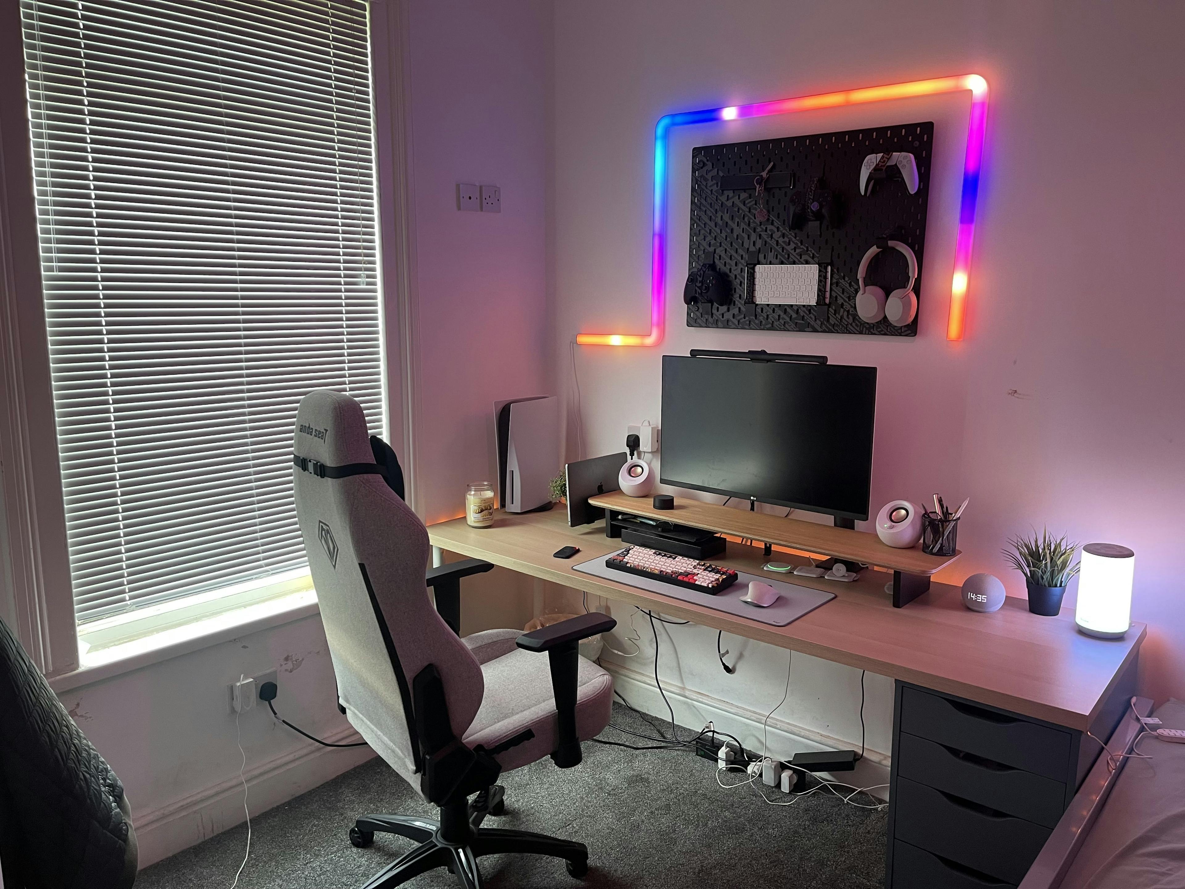
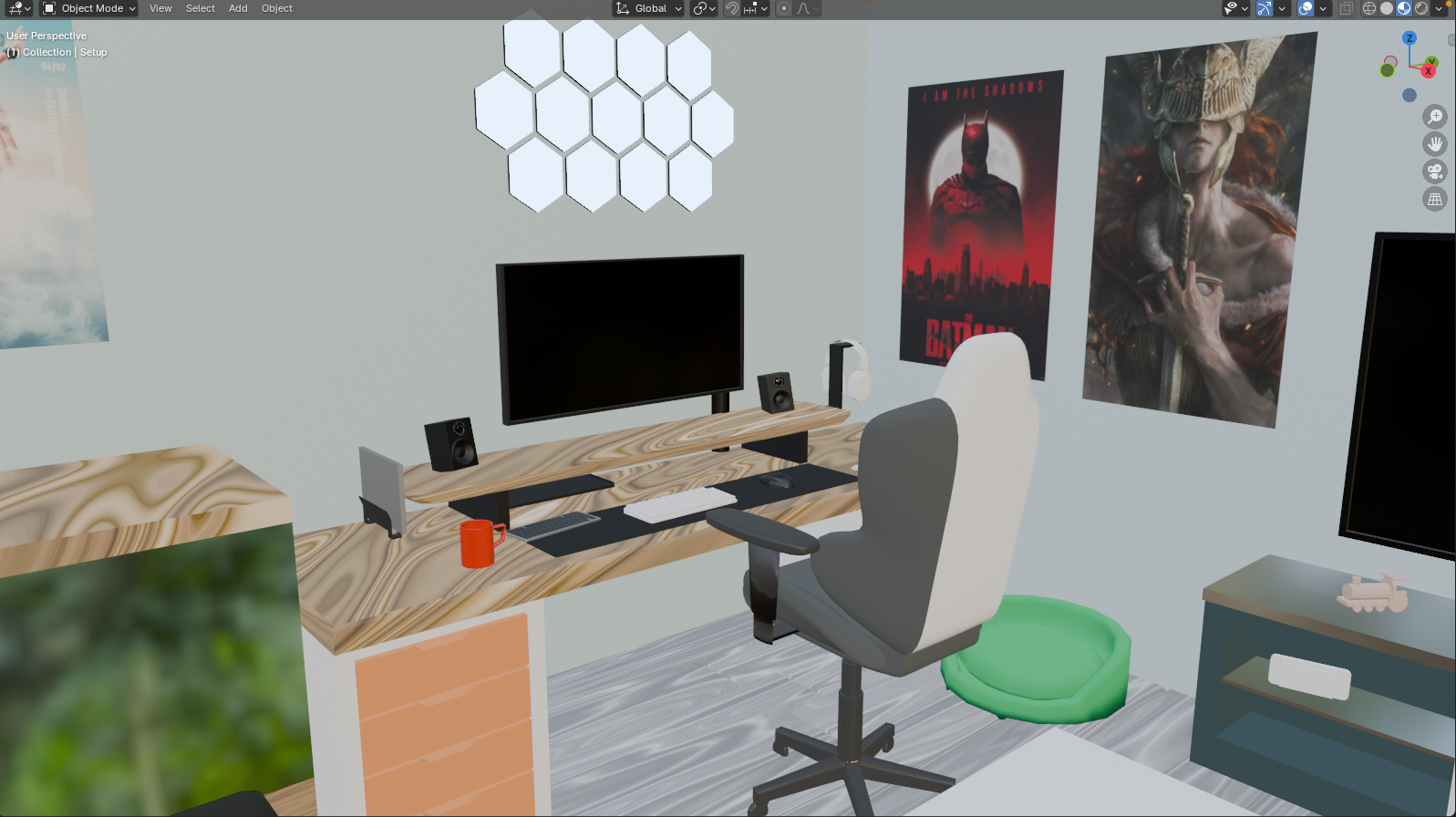
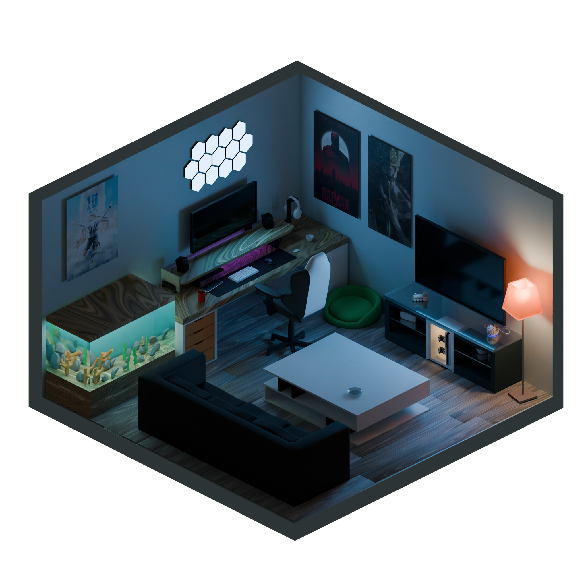
The main idea started with a trial to replicate the computer setup owned by the client on Blender, as it worked pretty well, we had a further interview with our client trying to identify what his visions of a perfect room setup would look like, not to mention that we also paid a visit to his room to gather a better to be able to work towards our overall 3d model.
We also looked Into exaggerating the practical lighting to give it more of the gamer vibes through the RGB elements and screen lights as well as the Hexagonal Light panels that were inspired by the Govee light products.
2. Background ( Aurora UI )
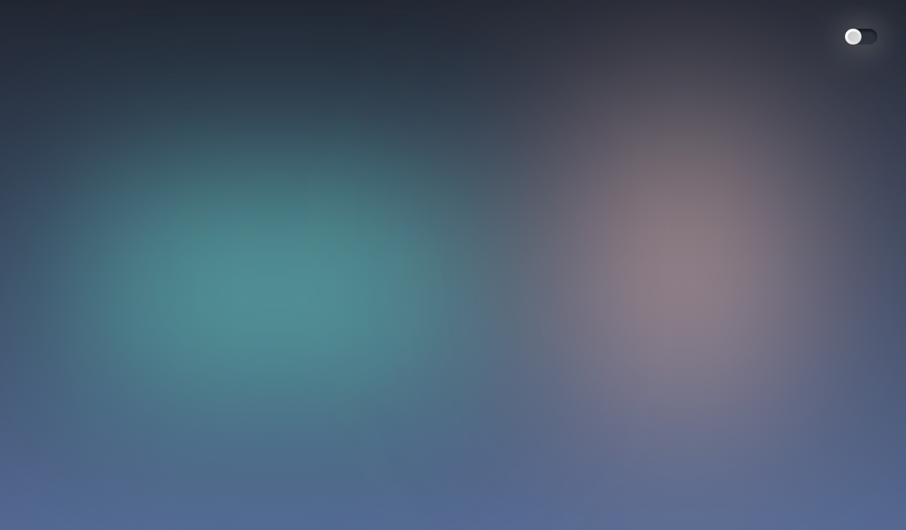
The Background Design was chosen to take the style of the aurora UI so it can act as a realm for the existent 3D model to add some depth, give off a dreamy look and blend seamlessly into the overall look.
3. Colours
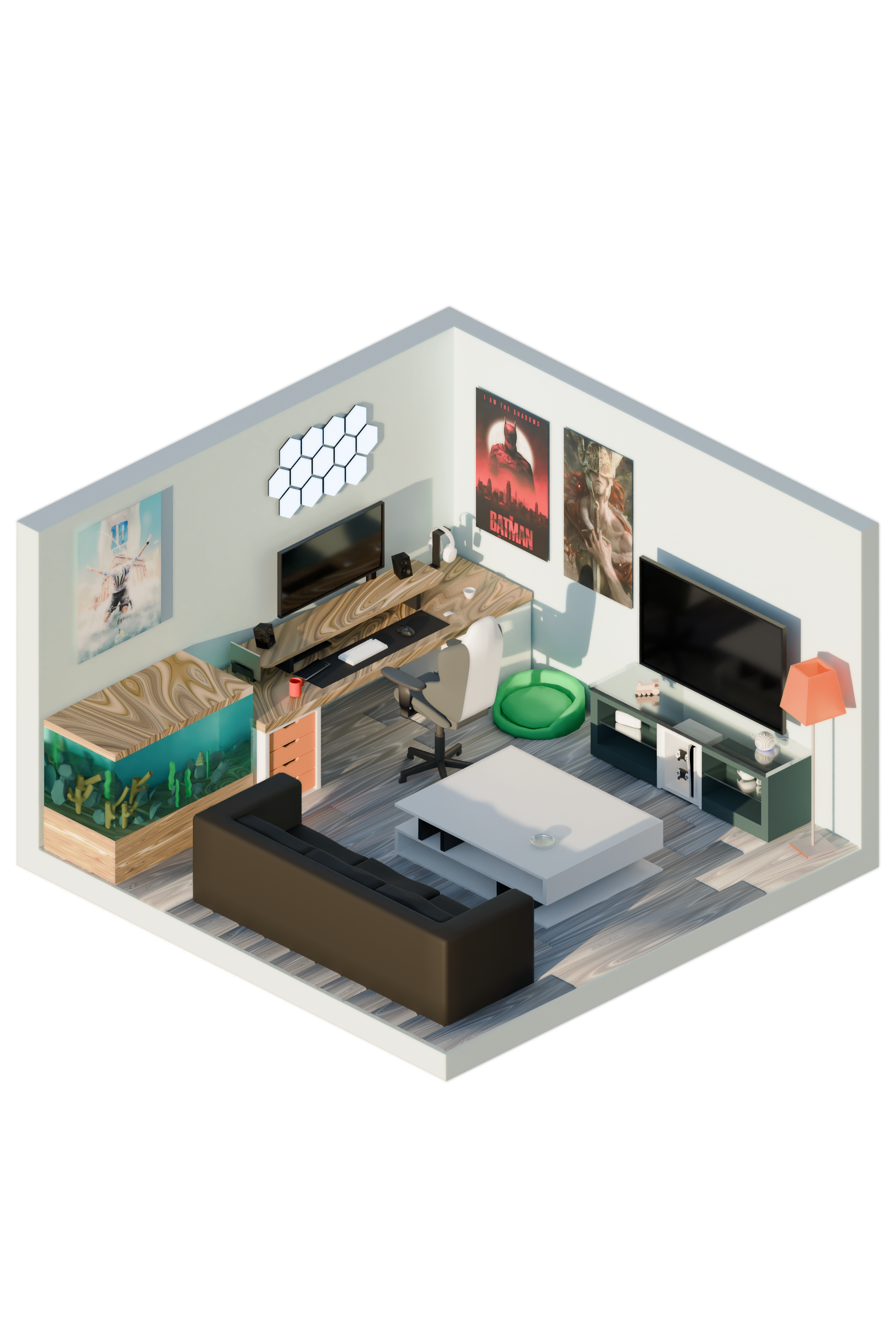

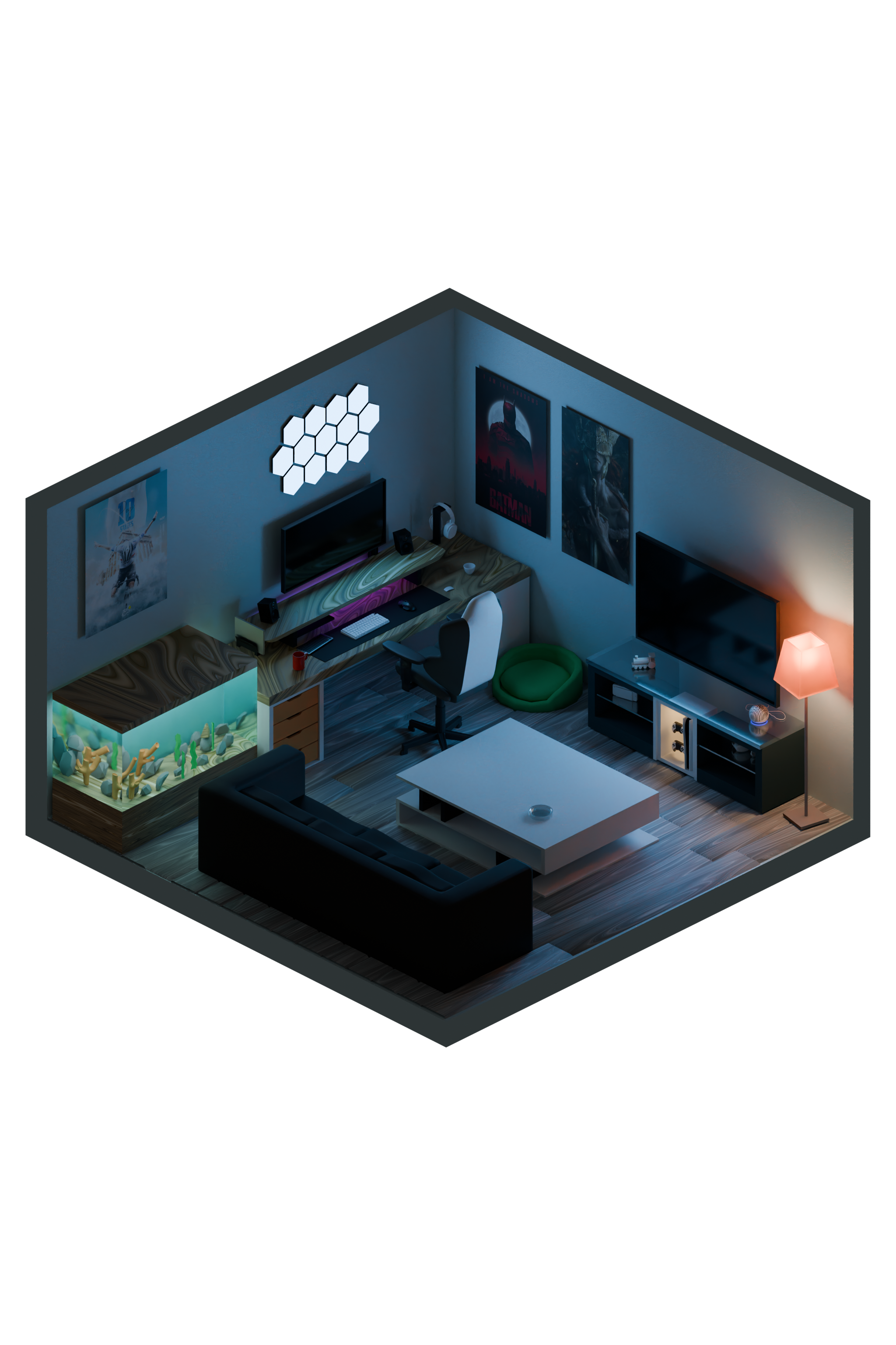

Most of the colours were mainly dependent on the colours of the practical lighting in both day and night themes in the 3D model and were made to serve the same dreamy look.
For the Text and UI elements the choice of Beige and Black was mainly to serve the text readability throughout an interchanging Background.
4. Fonts and UI Elements
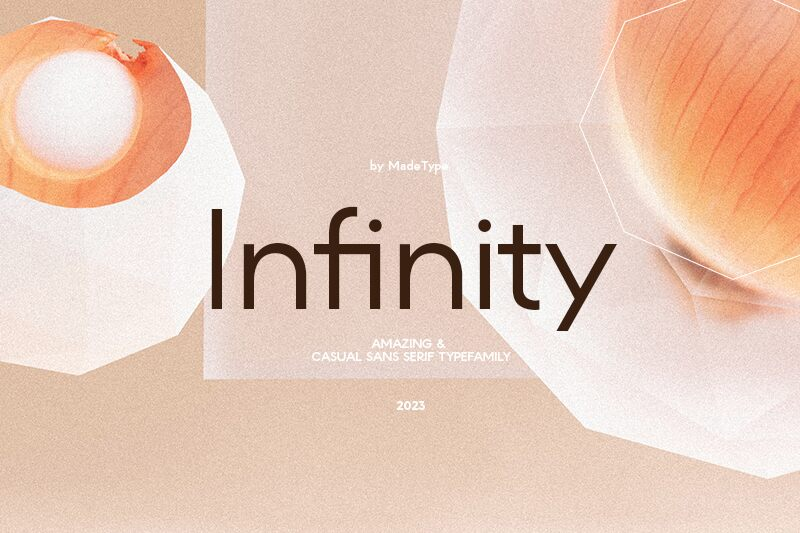

The choice of the font family Made Infinity was to give off both the digital and playful vibes which suits our clients lifestyle that involves Video gaming and Software Development.
On the other hand, the Ruler on the margins of the page was more of a Functionality decision to serve as a timeline of his career that is demonstrated into his CV.
5. Animations
Animations were a key factor in the whole experience where different animations throughout the experience were used to deliver different feelings to the user:
Fading Animations: Most of the changes that happens between the day and night theme occurs through a fading animation to give off the feeling of the passage of time between day and night as well as to serve into the overall dreamy vibe.
Text Reveal Animation: This was mainly intended to give off more of this digital look takes up a massive part of the client's lifestyle, not to mention how it synchronises with the change of the elements on the screens in the 3D model.
6. Final Results

The development of the Devmo portfolio website showcases the intersection of creative design and client-centric functionality. Starting with a 3D model inspired by the client's own setup, we meticulously crafted the environment to align with their vision, incorporating striking lighting effects and atmospheric design elements. The Aurora UI serves as a perfect backdrop, blending the dreamy ambiance with practical lighting, while color choices reflect both day and night themes. Smooth animations elevate the overall experience, transitioning effortlessly between themes and bringing digital elements to life.
Explore the final result on DevMo Portfolio Website.